Stata code and datasets to produce a wide array of graphs
Each example below consists of a dataset, a do-file, and a LaTeX file that imports the figure, resizes it, and provides it with title and footnotes. The three files are contained within a zip file you can download. Obviating the need for the venerable “auto.dta” dataset, the datasets are from my research. Making explicit all default options, the code is comprehensive but clear, allowing you to fine-tune all components of the graph—plot region; aspect ratio; format and content of both x- and y-axis; colors and line widths; added text and lines; legend.
List:
Simple barsSimple time seriesBalance testFunctions that illustrate an economic theoryLocal linear regression with histogram of the x-variableScatter plot combined with the densities of the variablesDifference-in-Differences: Descriptive statistics (few time periods)Difference-in-Differences: Descriptive statistics (many time periods)Difference-in-Differences: Regression results by time period (many observations and time periods)
SIMPLE BARS
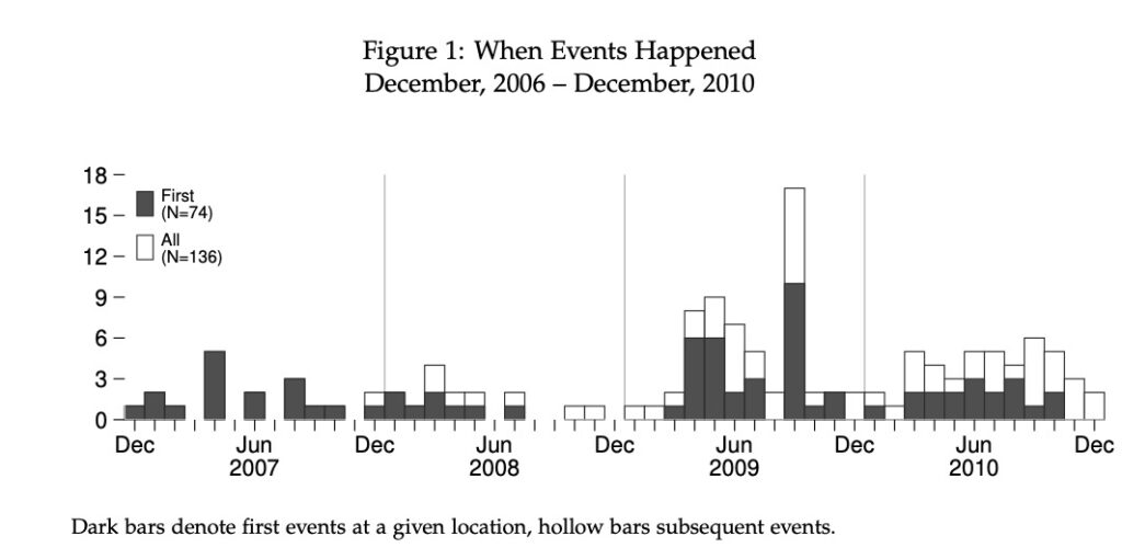
The stacked bars simply are two bar-series overlaid, an approach I prefer. In this example the aspect ratio is 0.25. To provide a cleaner look, I removed the lines from both the x- and y-axis while keeping the ticks. Double and special commas allowed me to use two rows of labels on the x-axis. I changed the default options of the legend extensively. Using “ring(0)” and “position(11),” I placed the legend inside and towards the top-left area. Using “symxsize(2)” and “symysize(3),” I changed the symbols to mimic the bars.
SIMPLE TIME SERIES
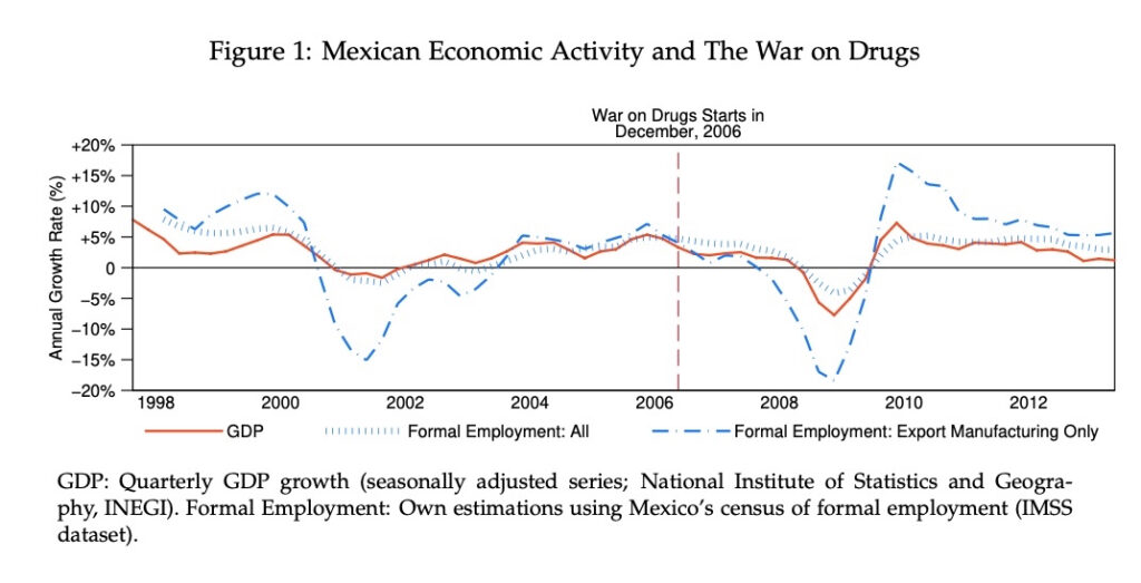
Wide aspect ratios suit time-series. I used added text to make explicit to the reader the event of interest. I changed the default options of the legend extensively. Using “bmargin(0 0 0 -4),” I trimmed the top distance to put the legend closer to the graph. Using “symxsize(10)” and “symysize(1),” I changed the symbols to increase the length of the lines.
BALANCE TEST
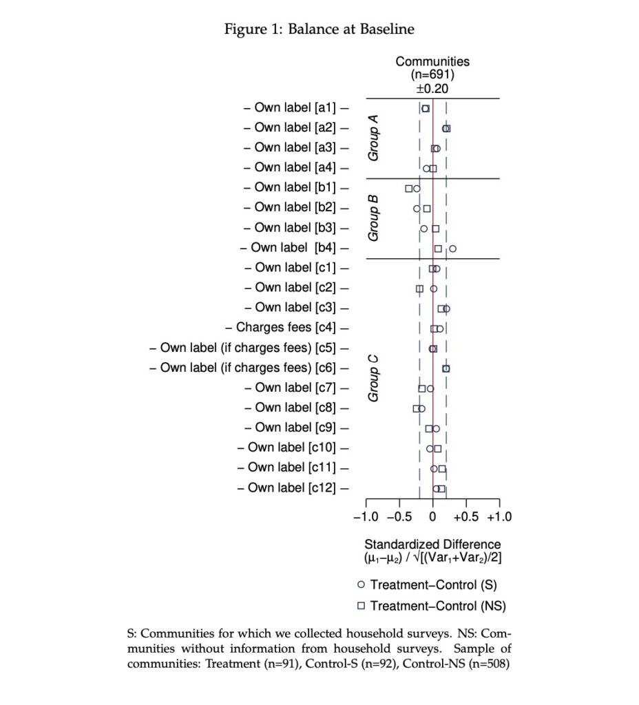
I used standardized differences (e.g. “tebalance summarize”) to feed a balance test graph. The dataset consists of twenty indicators from an experimental sample of rural communities. All indicators point in the same direction (they are good attributes), a practice one should follow when assessing balance. I used a narrow aspect ratio to focus the gaze of the reader towards 0, a location where points of the scatterplot should agglomerate. Because all indicators point in the same direction, the wavy pattern within a narrow area around 0 reveals lack of systematic differences between groups.
Added ylines demarcate group of indicators, added xlines a region of 0.20 standard differences below and above 0. Added text enhances the graph. Rotated text–“orient(vertical)”–labels each group of indicators. Additional text relies on special symbols (“{±}, {&mu}{subscript: }, {&sqrt}”)
FUNCTIONS THAT ILLUSTRATE AN ECONOMIC THEORY
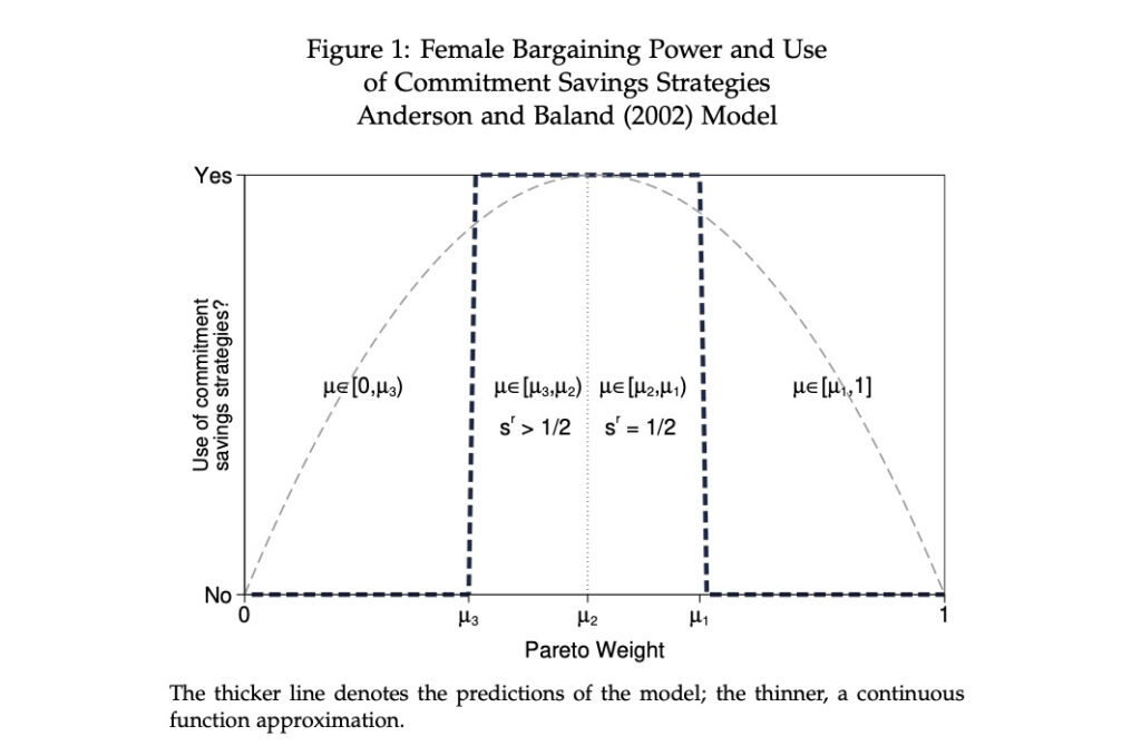
Relying on functions, the example uses no data. Added text uses special symbols ({&mu}, {&isin}, {subscript: }. Using “margin(0 -5 0 0),” I put the title of the y-axis closer to the area of the graph.
LOCAL LINEAR REGRESSION WITH HISTOGRAM OF THE X-VARIABLE
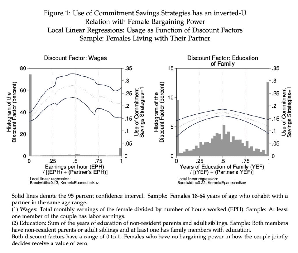
Simultaneously depicting the density of the independent variable and the local linear regression (LLR) can be illuminating. The economic theory I analyze posits an inverted-U relation between bargaining power and take-up of a commitment savings strategy. Pareto weights embody bargaining power but they are unobserved. Discount factors serve as their proxy.
Patterns in both panels accord with the economic theory (see example 4). In panel A, the relation between an earnings-based discount factor and take-up (LLR) accords with the theory, but the confidence interval is wide. Explaining why, the imposed histogram reveals that few observations compose most of the range of the independent variable. (I prefer to use a histogram to a kernel density because distinguishing the density from the LLR in a graph is hard.) Amassing most observations at zero, many females in the sample had no labor earnings. In panel B, the relation is clearer. It uses a different discount factor, one based on the educational attainment of family members. The imposed histogram reveals mass points throughout the whole range. The confidence interval, in turn, is narrow and of similar width throughout.
SCATTER PLOT COMBINED WITH THE DENSITIES OF THE VARIABLES
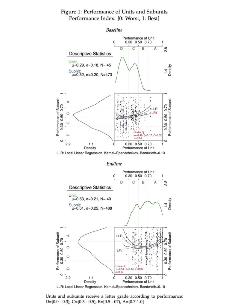
I based the example on the section of the Stata manual on “graph combine.” The manual guides on how to locate the y-axis on the right (top-right quadrant graph: “yscale(… alt)”) and on how to rotate the graph (bottom-left quadrant graph: “horiz”). I used the empty area (top-left quadrant) to provide essential descriptive statistics.
DIFFERENCE-IN-DIFFERENCES: DESCRIPTIVE STATISTICS (FEW TIME PERIODS)
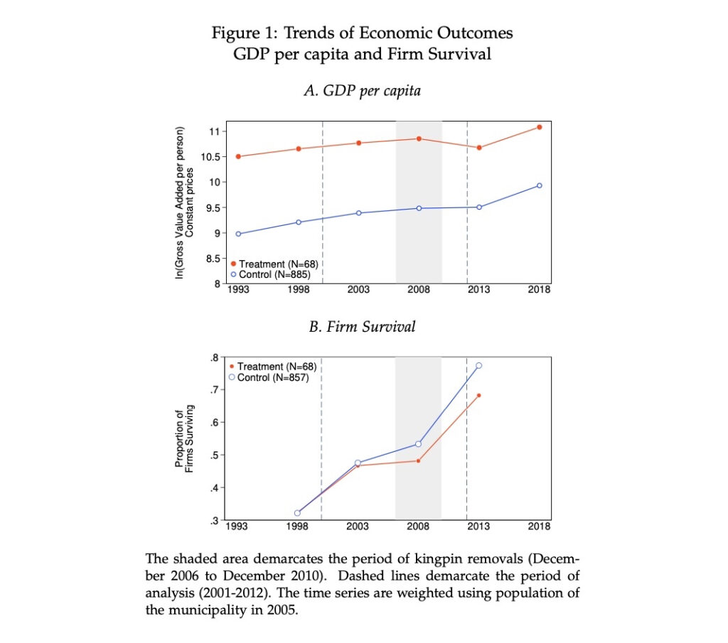
I demarcated the period of interest using “xline(2008, lwidth(16) lc(gs15)).” First I added two lines, one for December 2006 and another for December 2010. Then I varied the width until the shaded region touched both lines, which I erased to finish the code.
DIFFERENCE-IN-DIFFERENCES: DESCRIPTIVE STATISTICS (MANY TIME PERIODS)
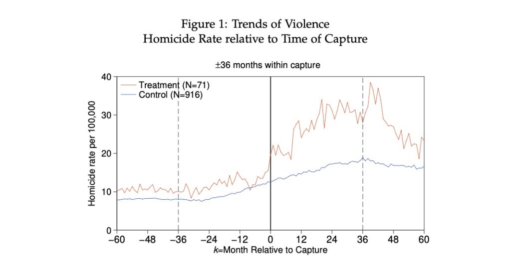
Taking advantage of the long span of the time series, I centered the graph on the month in which the event of interest took place. Adding text outside the range of the graph, I labeled the demarcated area using ‘text(42 0 “{±}36 months within capture”, placement(n) size(medsmall))’.
DIFFERENCE-IN-DIFFERENCES: REGRESSION RESULTS BY TIME PERIOD (MANY OBSERVATIONS AND TIME PERIODS)
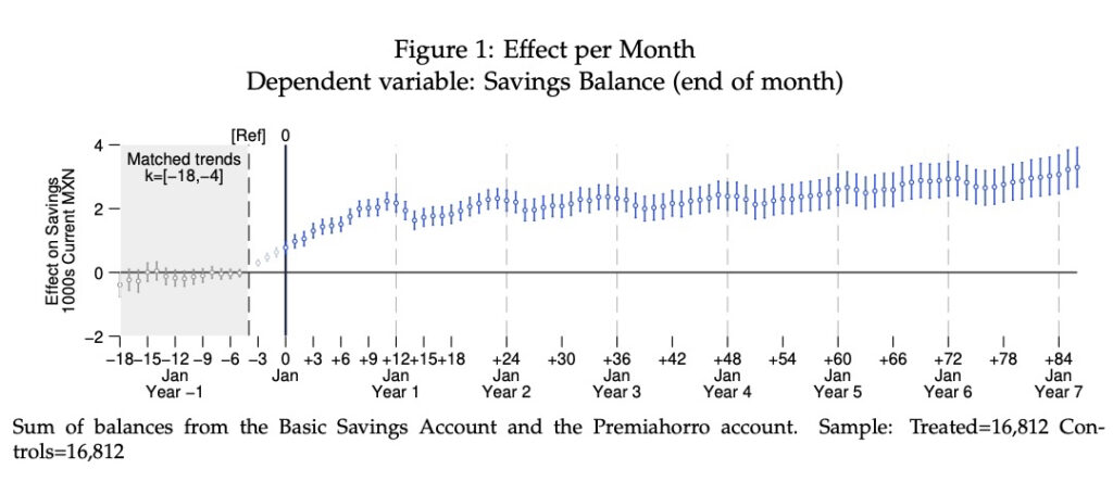
In this example the first do-file estimates the per-period regression and creates a dataset with the results (estimates, confidence intervals, etc.) The second takes the dataset and produces the graph. Narrow confidence intervals stem from the towering size of the dataset (T=105; N=33,624; NT=2,811,696). Beware, the first do-file runs slow. It takes my computer 2m30s (Apple Silicon M1 Max; Stata 14.2 MP running through Rosetta 2).